TLDR A tale in 45 seconds
My partner and I share a life but not every account or plan, and no app we tried handled that mix. After a demo at work showed AI building UI from our own design system, I wanted to understand these tools first-hand. So I turned the spreadsheet I’d built in 2024 into TwoCents, an app for our money. Once I saw what was possible, I built a second for our shared calendar and tasks named TwoDay. I didn’t write the code. I led Claude the way a design lead leads a team: a roadmap, written plans, regular audits, and a dated log of every decision. Since April we’ve used TwoCents, settle-up happens instantly, and the two apps replaced three we paid for. Building end to end also made me a sharper designer, and clearer than ever about what only a designer brings.
Part 1
TwoCents
Our money: a finance app for what’s mine, yours and ours.
01 The Problem
My partner and I dated for seven years before we married. Like a lot of couples, we kept our own accounts alongside shared ones. And as in many households, one of us ended up running the bills: property tax, utilities, and the rest all come out of my accounts. So every month we need to know what’s mine, what’s yours, what’s ours, and who owes whom. No app we tried fit how we actually live. Buddy handled settling up but never gave us the bird’s-eye view or control we wanted.
So, in 2024, I spent about two weeks building the spreadsheet I’d always wanted. On the first of every month, we each entered our income and expenses into our own file. Each sheet broke them down into categories and automatically created charts and tracked goals. We each marked our shared transactions, and a settle-up page worked out who owed whom, split 50/50 since we earn about the same.
It worked, but settling up was slow and fragile. One of us would finish, wait for the other, then copy a number from one spreadsheet into the other and check it. Sometimes the math broke, creating discrepancies: a transaction was marked shared by mistake, or a formula didn’t reach the last row.
02 Spreadsheet to App
It all started with a demo at work. Copilot built a front end from our own design system, and honestly, it scared me a little. I’ve always been a creative person with an eye for detail. I’d learned some HTML and CSS in university, but I never had the time to go further. I had ideas I wanted to build, and now I saw a way. I downloaded Claude that night and picked a first project I knew inside out: the spreadsheet. I’d designed it, so I’d know right away if something was wrong. We used it regularly, and if I found it clunky, my partner must have liked it even less.
I didn’t write the code. I ran it the way I’d run a design team. I kept a roadmap, decided which features to deepen and in what order, and wrote a plan before anything got built. Regular audits of our work showed me where to focus next and ended in open questions only I could answer. Every answer I gave is recorded in my own words, dated, next to the question it settled. That way, when a decision came up again weeks later, the reasoning was right there.
Working this way let me switch skill sets quickly: UX writer one hour, accountant the next, trying an interaction three ways before taking a step away. It became easy to try new ideas, going from a rough sketch to polished code in minutes. What Claude couldn’t do was decide what mattered most. The faster a team moves, the more that clarity matters, and it’s the part of this work I’m strongest at: seeing the whole experience and deciding where to focus next.
I built for the web first, on purpose. It was quick to change, we could both use it right away, and it proved the idea before I paid for an Apple Developer account. I built its first design system with Claude Design for web, then redid much of it for iOS. That was fine: the second time, I was faster and more strategic. The web suited TwoCents, since finance is a monthly job we often did on a laptop.
However, I knew it would be great on my phone, where I could quickly add a transaction in the moment or check on a goal. I explored a PWA first, but knew the long-term answer was a native iOS app, since we’re both in the Apple ecosystem. In July 2026, I moved it to native iOS, where Face ID makes a finance app safer and faster to open, and TwoCents sits next to our banking apps.
03 Key Decisions
This app deals with a couple’s money and relationship. The most important decisions depend on knowing how those things feel day to day.
1Let’s show the number you can trust
The hardest question in TwoCents sounds simple: which number do you see? If you split a bill, do your totals count half? If you buy something for your partner, whose spending is it really: yours or theirs?
Claude’s first model folded the split into your totals, and it looked tidy. But when you check your bank account, you ultimately care about the money that left it. What might come back after settling up at the end of the month is all ifs and maybes. So, I set the rule: your spending shows exactly what went in and out of your accounts, and splitting only exists for settle-up.
Claude helped me put words to what I meant. Who owns a transaction and how it gets settled are different things, and they should never share a field. Once we separated them, 744 transactions that two screens had been counting differently finally agreed. Joint accounts follow the same logic. There’s no split on a joint account in real life; you both just have access.
Trust shaped smaller calls too. $0 is a claim, so if the app can’t load a balance, it never shows an empty one. Settle-up only counts money that has actually been spent. And every figure has a plain-language answer under Settings, in a section called “How your numbers work”.
Even the sign on a balance became a design problem. Negative is a math word, so a debt is now a named choice in the account’s own words: “Owe” or “In credit” for a card, “Balance” or “Overdrawn” for chequing. If you flip it, the form checks with you: “This records $250.40 in credit. Last time it was $2,527.06 owing.” It all comes back to trust. With the math now happening behind the scenes, the app has to earn it — something the spreadsheet never did, and an app this complex needs even more.








2Let’s never connect to a bank
Connecting to our banks would have saved effort, and it’s the first thing most finance apps do. For me, it was always a red line.
Part of it is how I think about money. I don’t really budget, and I don’t want my expenses added for me. Entering them at the end of the month is methodical, almost meditative, and it’s what makes me notice my spending. The app makes that easier, with trends at a glance. It’s not for everyone, and that’s what’s exciting about building your own software now.
The other part is knowing what I don’t know. Our data is stored in a secure, private database, and it’s personal, but none of it is critical financial data like card numbers or bank logins. I wouldn’t trust myself, even with AI, to build something that needs that level of security, so I designed around it.
3Let’s plan for a household ending
The hardest version of yours, mine and ours is what happens when a household ends. The answer has to be right in the numbers and in the database, and it has to feel fair at one of the worst moments in someone’s life. My rule was that shared history belongs to both people:
- shared things become each person’s own copy
- neither person can see the other’s private things anymore
- recurring bills go to both, since a missed bill is worse than a duplicate
- anything still owed is saved at the split, so no debt quietly disappears
4Let’s design for two, and be ready for more
Every month, settle-up night doubled as a usability test. We both sat down together, entered our transactions and settled up. Whenever something broke or felt slow, I fixed it with Claude on the spot.
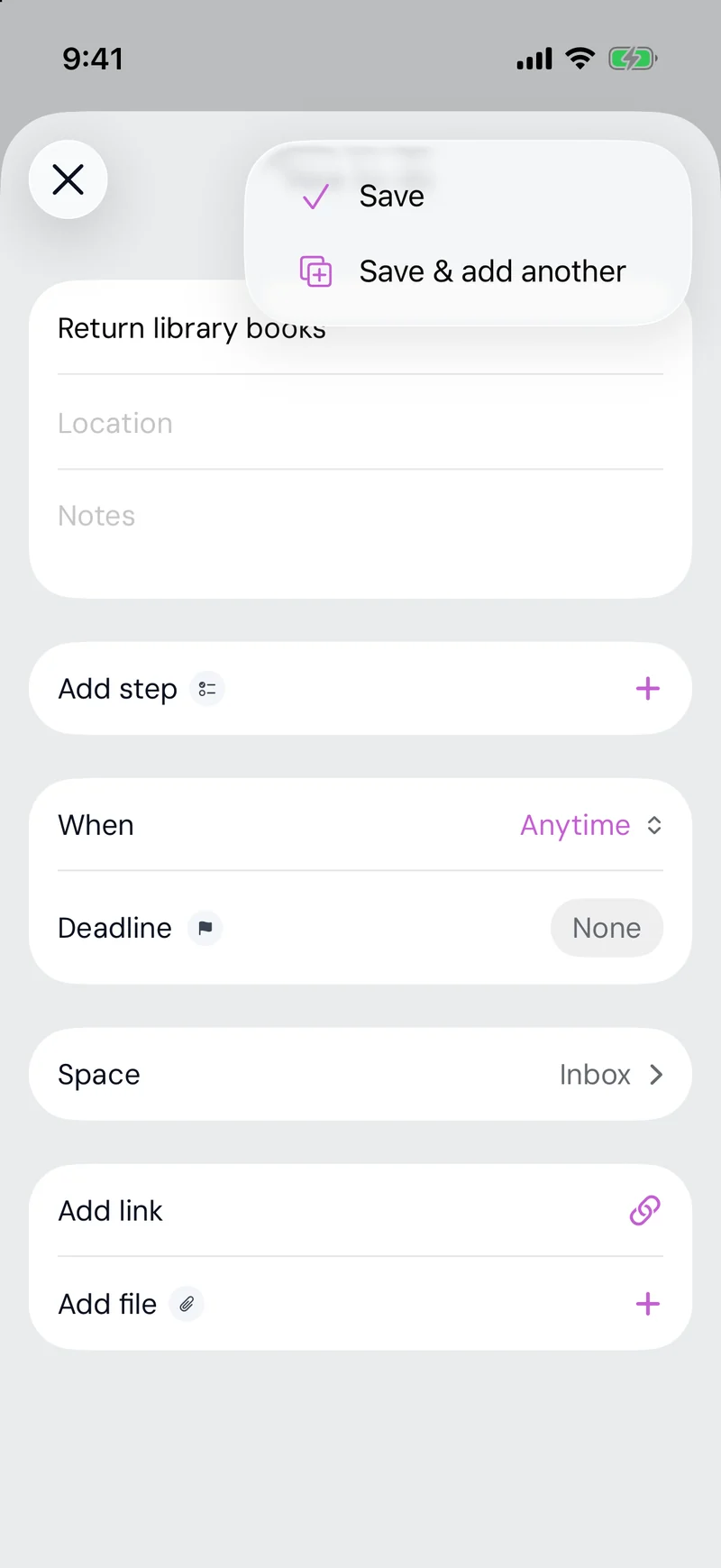
My partner’s feedback shaped one of my favourite details. She told me adding transactions had become slow — and she was right. You enter a month one bank at a time, so you want to keep your momentum and keep what you’ve already filled in. Now the Save button offers Save & Add Another, which keeps the account and date ready for the next one.
The app is built for the two of us, but I designed it as if a friend might use it tomorrow. Every feature has its happy path, edge cases and error states, even ones we hope never to face, like paying off a debt or fixing an over-contribution to an RRSP. If I handed it to a friend or submitted it to the App Store, there shouldn’t be holes I’d skipped because it was only us. It was also an experiment: could I build a fully functional app others could use, even if I never release it? The answer was yes… with a lot of time and work.
04 The App
This is the part I couldn’t show in my other work: what it looks like with no legacy system to design around. Below is the real app, from a demo household.
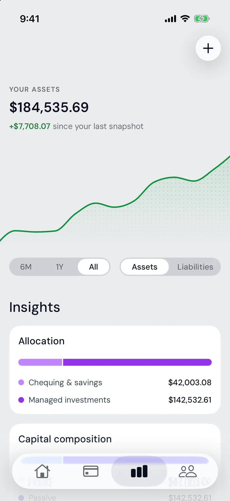
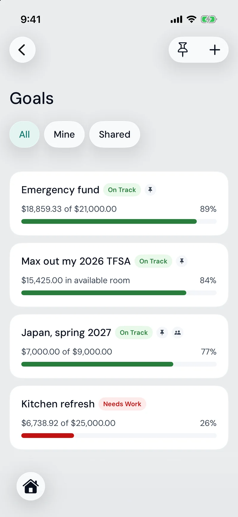
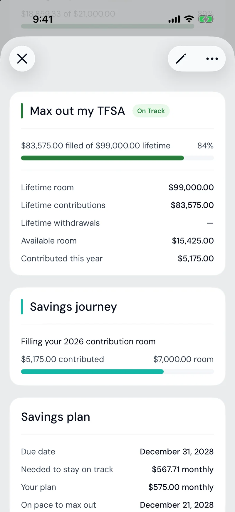
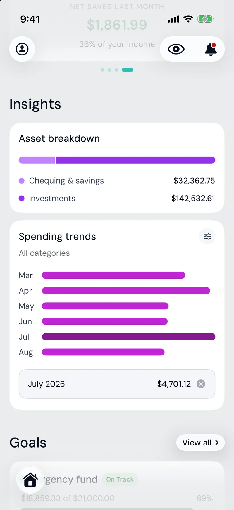
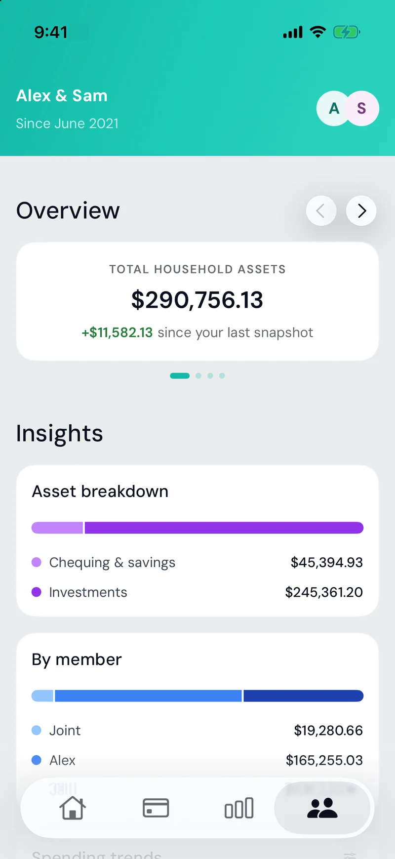
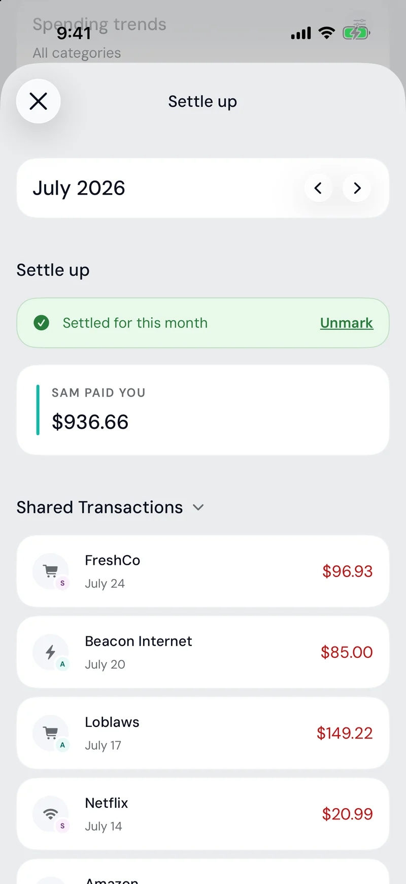
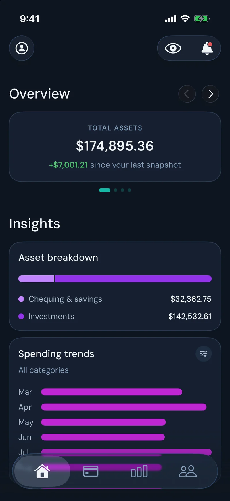
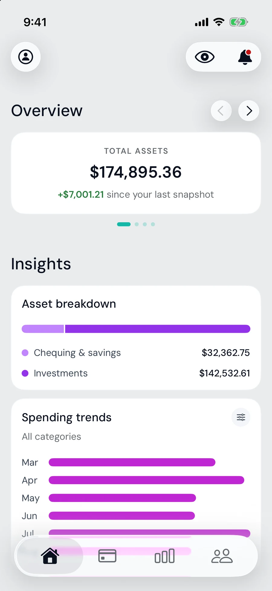
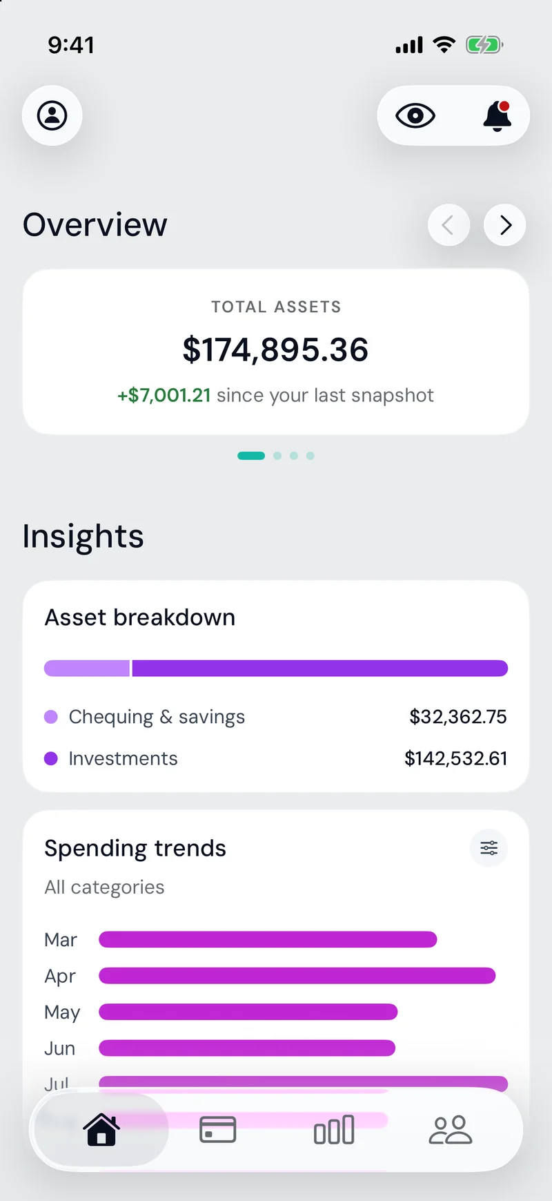
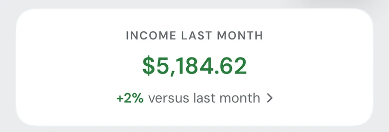
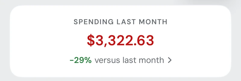
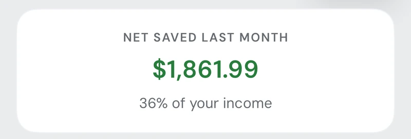
TwoCents is our monthly money routine. It has a dashboard of income, spending and net savings, goals that track shared targets person by person, and a TFSA tracker that knows each year’s contribution room. Spending trends can be broken down by month and filtered by category, and settle-up closes each month.
TwoCents has fun too. Shake the dashboard and coins fall. Cross a new $100K milestone and they fall again with a congratulations. If you’ve hidden your balances, it still celebrates, just without showing the number.
05 Outcomes
- Settle-up is instant
- as soon as we’ve both entered the month
- April 2026 – Today
- our household has run on it, first on the web and now on iPhone
- 3
- paid apps cancelled across both apps: Buddy, TimeTree and Cupla
Settling up used to take a conversation, two spreadsheets, and a double check. Now the balance updates automatically as we add transactions. On the first of the month, we each get a notification to add our transactions. When I’m done, I tap that I’m ready, and my partner gets a notification to do the same. And because every settle-up shows the transactions behind it, we can trace the math ourselves. It’s faster, we talk about it more, and we trust the numbers.
My partner now uses it on her own to fill her TFSA and grow our emergency fund.
Part 2
TwoDay
Our time: our shared calendars, date nights, and tasks.
06 The Problem
We have changed calendar apps almost every year: a shared Google Calendar, then TimeTree, then Cupla. Cupla understood scheduling for couples the best, but its roadmap drifted towards meal planning and an AI chatbot, which quickly made me look for alternatives. At the same time, I paid for Things 3 assuming I could share lists with my partner. It turns out, you can’t.
TwoCents had already solved what’s mine, yours and ours for our money. So I extended the same model to our time: shared calendars, date nights and tasks. TwoDay is something you check all day, which is what phones are for, so it moved to iPhone alongside TwoCents in July 2026. In truth, TwoDay is what prompted the move: it was the iPhone use case I’d been waiting for.
07 Key Decisions
1Let’s keep yours, mine and ours clear
Most calendars answer “Whose is this?” with more calendars. Google lets you make as many as you like, and I find managing them exhausting. Cupla simplified it to three views: me, my partner and us. I built on that by keeping three lenses (Mine, Theirs, and Ours) and adding tags for everything else.
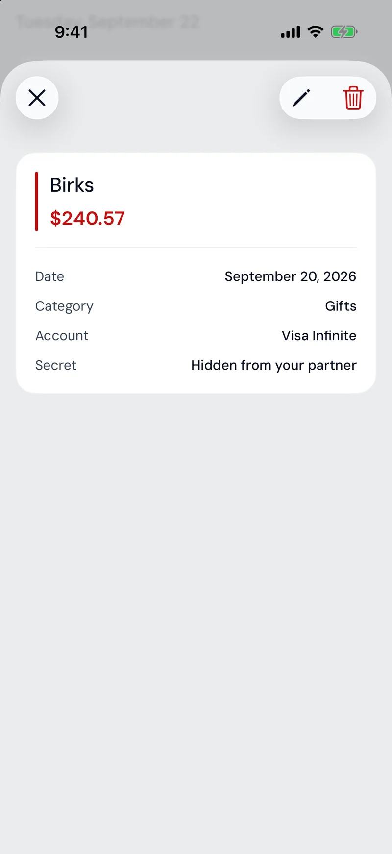
Privacy needed the same clarity. A shared calendar that hid half of itself wouldn’t be shared, so “Mine” still shows to your partner. Privacy is a separate control: who something belongs to, and whether it’s Secret. Only your own things can be Secret, and the form shows it. Move an event from your calendar to Ours and the Secret switch simply disappears. It mirrors TwoCents: you can see your partner’s transactions, and make your own Secret. Each person’s colour follows them across both apps, on calendar events, filter chips, avatars and the Mine and Theirs tags on transactions.
2Let’s make moments that feel good
Some of my favourite decisions are about how the apps make us feel, and about nudging us toward the habits we both want to keep.
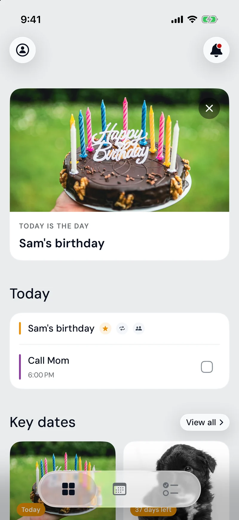
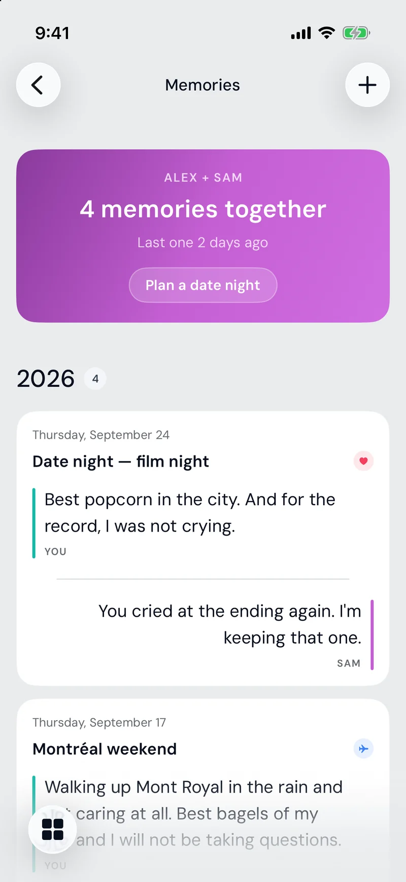
Key dates count down to birthdays and anniversaries, and on the day itself the home screen celebrates. Holidays are left out on purpose, so the moment stays special. Memories have a twist: you can’t read your partner’s reflection on a moment until you’ve written your own.
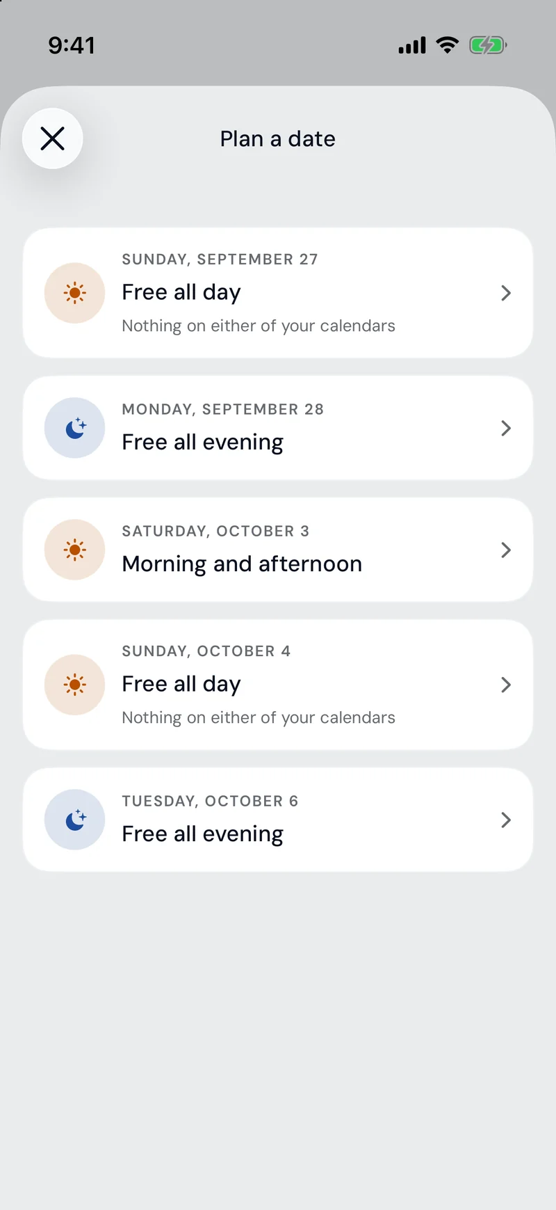
Date night is designed to actually get booked. The planner finds the evenings that are free on both of our calendars, and naming the plan is optional, because asking for a plan up front is how a date never happens. There’s no invite to accept, either. We’re two people who can talk to each other, so the notification reads as good news, not a request.
To-dos in TwoDay borrowed Save & Add Another from TwoCents, so a list fills as fast as a month of transactions, which is perfect for a brain dump.
3Let’s make every screen agree
As the apps grew, every screen looked right on its own. Side by side, across two apps, the same idea had been built in several slightly different ways. We had a design system; it just wasn’t applied everywhere.
I stopped adding features and went back through everything, component by component and page by page. For each component we found every version in both apps and compared them, and then I set the standard. The result is one design kit both apps share, with about 100 components and a brand setting that makes TwoDay purple and TwoCents teal.
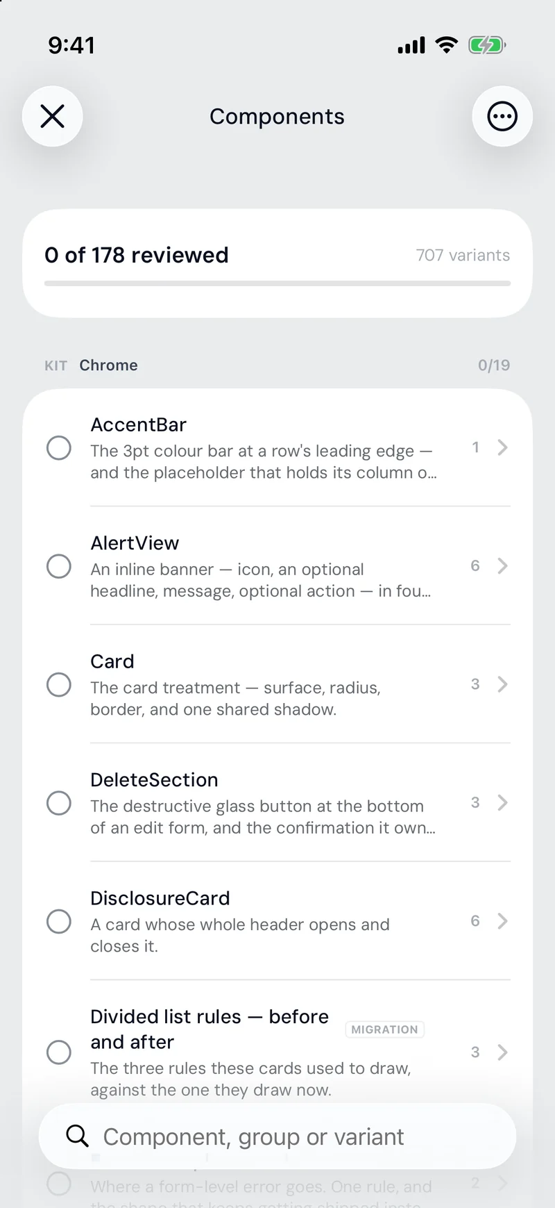
A live gallery inside the app shows me every component as it actually exists, and each one can be switched to the largest text sizes, dark mode, right-to-left and Reduce Motion without leaving the page. It took a long time, but it paid for itself: new screens now start from components I’ve already approved and it’s much faster to build new features.
08 The App
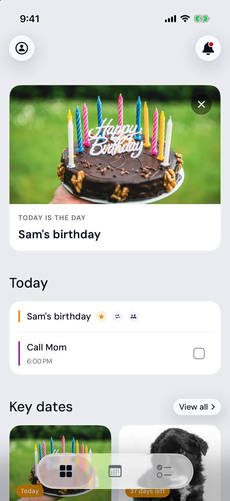
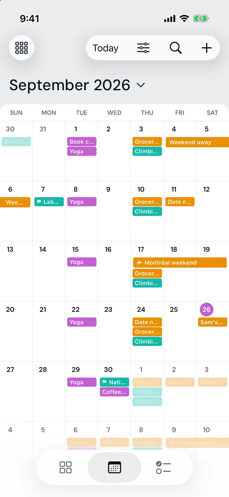
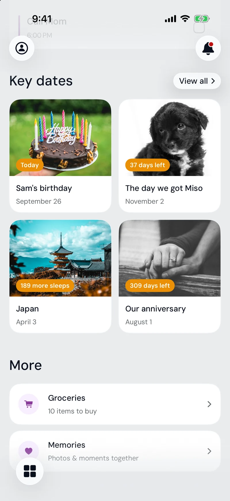
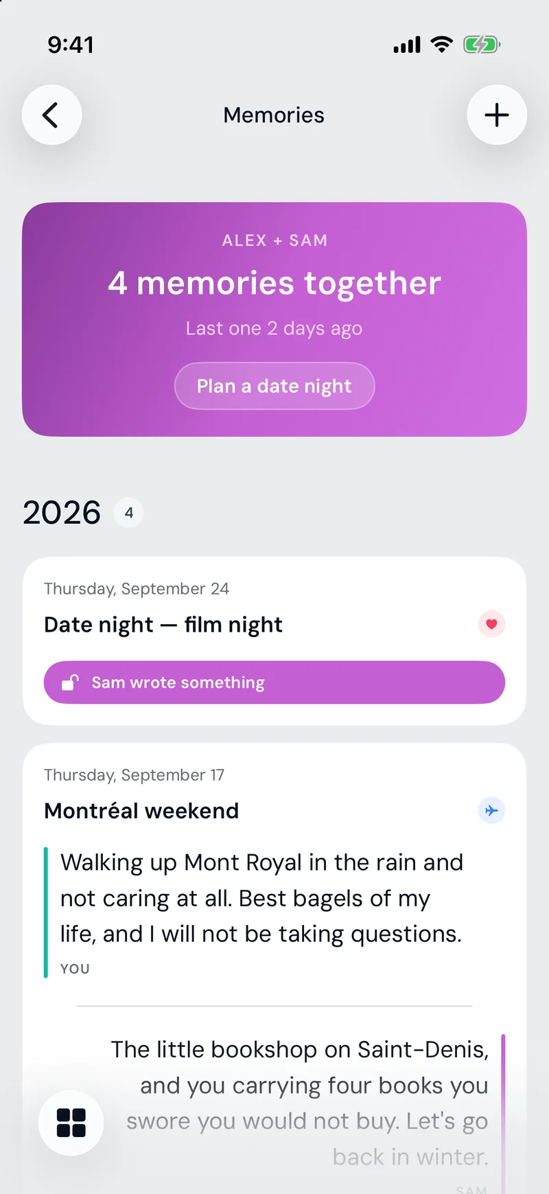
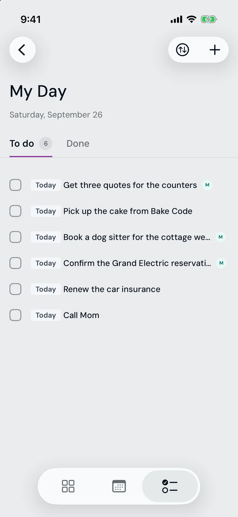
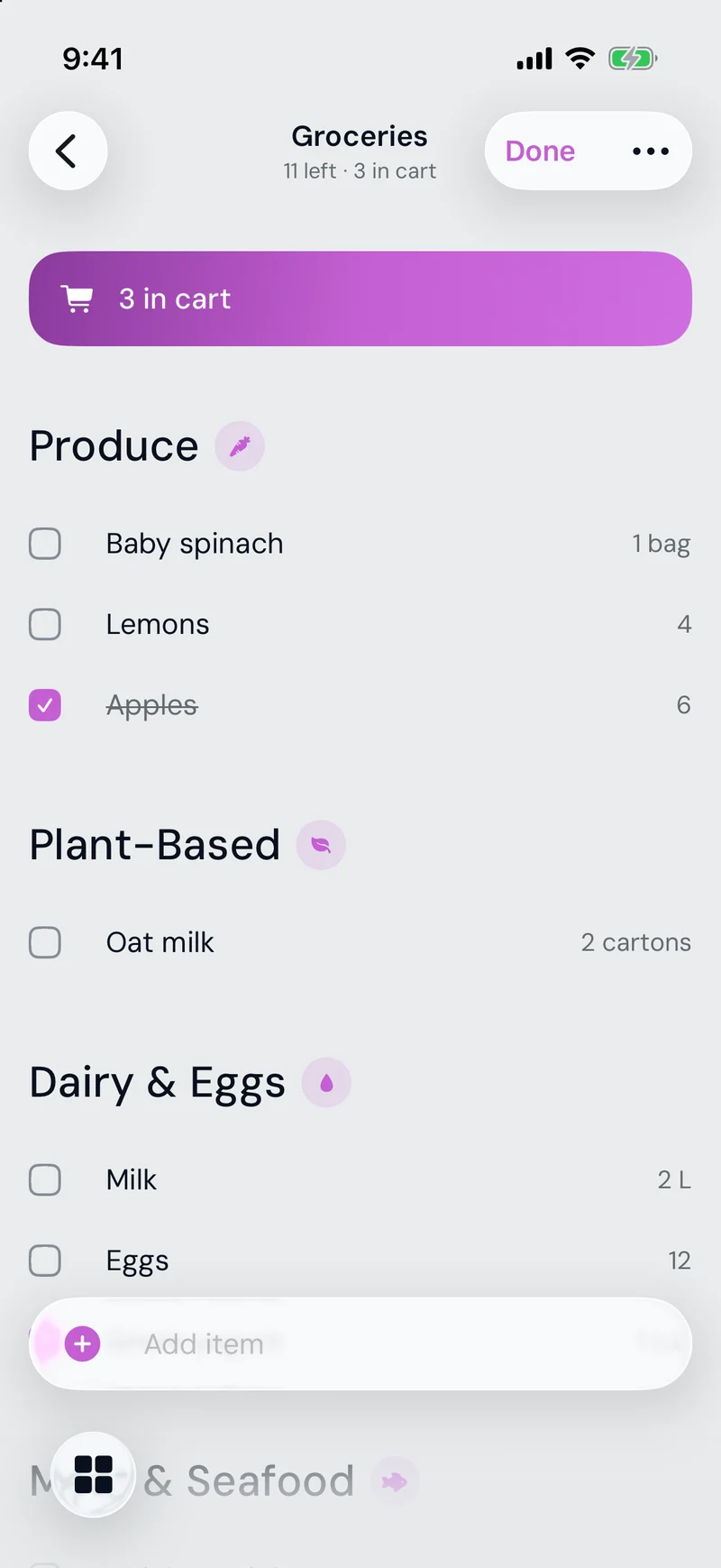
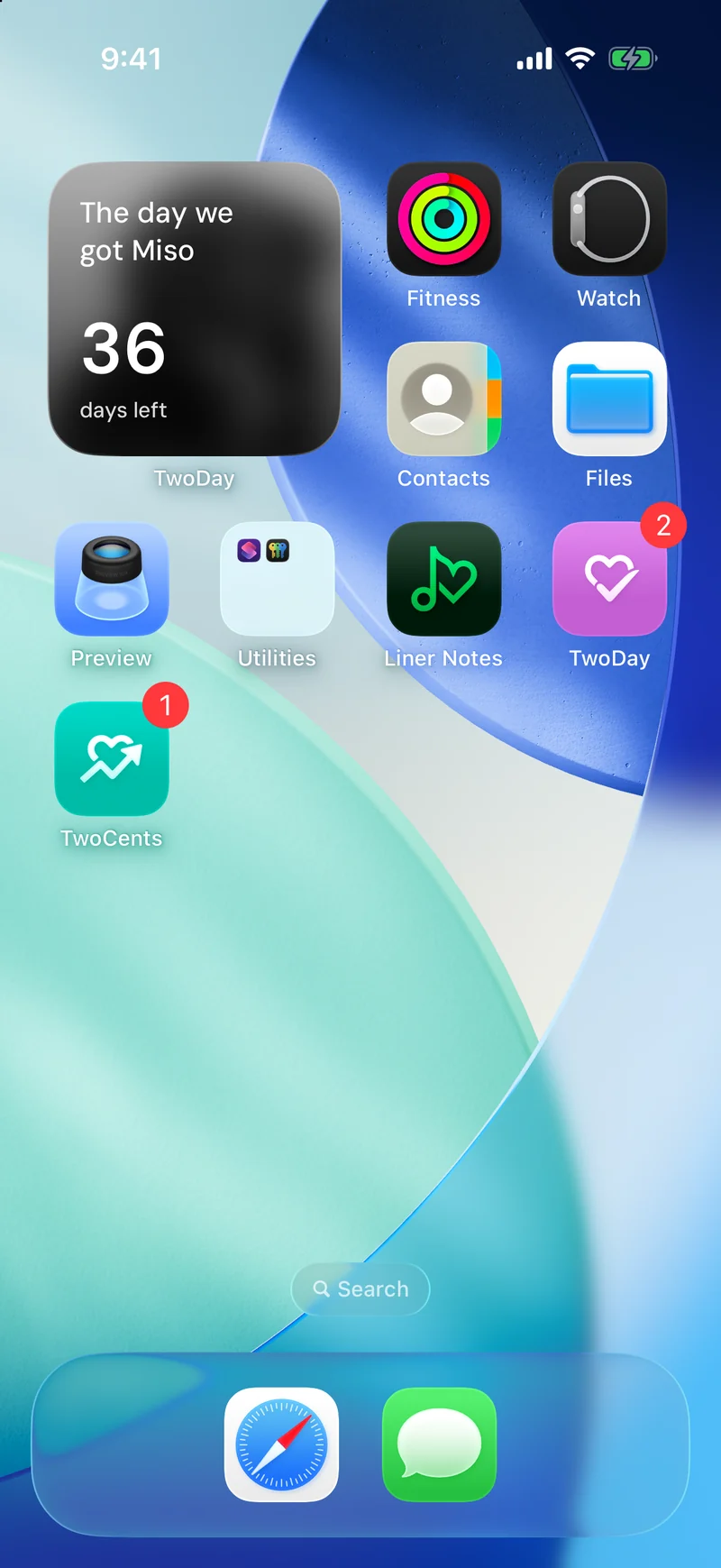
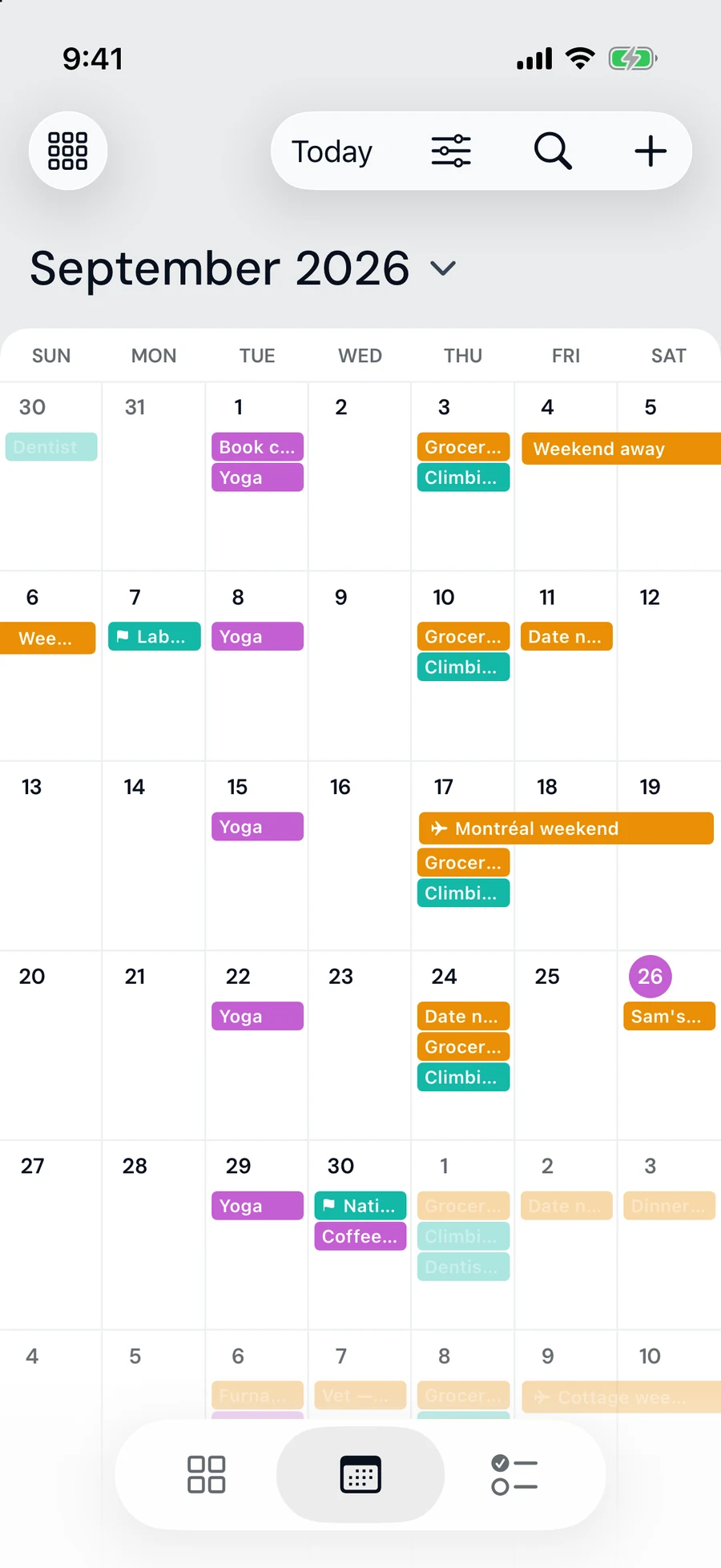
TwoDay covers the rest of our shared life. The calendar has Mine, Theirs and Ours lenses, and trips that stretch across the days they cover. Key dates have photos and a countdown widget, and memories have reflections you unlock by writing your own. There are shared and personal to-dos, and a grocery list sorted by aisle that follows you into the store as a Live Activity. And, like TwoCents, it keeps growing every time my partner and I come up with a new idea.
09 What I Learned
I used this project to try every tool I could. Figma Make gave me rough layouts to react to, and I built the real designs in Figma until they felt like mine. Claude and Codex wrote the code, and I found my way around the command line, GitHub and Supabase. When a technical decision came up, I asked Claude to explain it until I understood. I’m not an engineer, but I follow those conversations at work far better than I used to, and I ask sharper questions too.
Building something end to end also changed how I see everything else. I notice the patterns, interactions, and hierarchy in the apps I use every day at a level of detail I didn’t before, and it’s made me a more thoughtful designer.
Most of all, it settled a worry. AI is fast and often incredibly useful, but the part of my job I love was never pushing pixels or fixing auto layout. It’s the thinking, the research, the leading, and the loop of testing with real people. Getting AI to a design that works as a system, scales, and still looks unique took a lot of direction. That’s where I come in, and the more I build, the more comfortable I am with that role and the more hopeful I am about what comes next.
10 What Came Next
Next, I plan to offer the apps to a few friends. They’re not on the App Store, but I’ve built them to meet its requirements, so they could be.
For years I had ideas I couldn’t build beyond HTML and CSS. Now I’ve taken a spreadsheet all the way to two native apps we use every day, and that still feels a little unreal. I’m also building two more apps: one to help me walk every street within a radius of my neighbourhood or city, and a Letterboxd for music with planned listening journeys that offer an album a day, as I dig deeper into music as a drummer in my free time. I’m building these to publish, using what I learned from our household apps, to see whether others are as interested as I am.