TLDR A tale in 45 seconds
Sun Life’s old retirement planning tool was going away. This would leave more than a million people saving through their work with no plan at all. I led the design of what would replace it: a three-step planner of our own, with our advisor software doing the math in the background. Instead of asking how much money people need in retirement, it asks how they want to live and works out the number. Over three rounds of testing, the share of participants who could finish a plan rose from 58% to 100%. It launched in April 2024 and over 137,000 people made a plan in the first year. Just eight months after launch, we had already beaten our yearly target by 27%. The piece we held back, an interactive results page that tells people what to do next, became my case for the tool’s next priority.
01 The Problem
Sun Life runs workplace retirement savings for more than a million Canadians. Our old planning tool was outdated, tested poorly, and its contract was about to end. Once it went away, all users would be left without a plan. Our own data showed that those with a simple retirement plan tended to save more and have more in their accounts. A replacement had to get a lot of people from “I should really do this” to “Done” while not wasting the time of people whose plan just disappeared.
There was also a behavioural challenge. While most people know they should plan for retirement, very few do. In discussions with our behavioural economics team, we learned that most people are apprehensive about planning, thinking of it as slow and complicated. A large barrier is getting started as many people are afraid of what they’ll find out or embarrassed by what they already know. On top of that, we know that finishing a plan can be a challenge as well. In usability testing, I found that just 58% of people could successfully create a plan using the old tool.
The obvious answer seemed to be right in front of us. Sun Life had partnered with Conquest — the planning software our advisors use in hour-long client sessions — with plans to integrate it into our website. It’s powerful but it’s also everything people fear about planning: complicated, hard to understand, and overwhelming.
02 My Role
I led the design of the planner from the first workshop to launch. I worked closely with my manager and a content writer on the experience design, and with our product owner and director of financial planning on strategy and the build.
I planned and facilitated a week-long design sprint to kick-off the project, designed every iteration, and ran three rounds of benchmark and qualitative testing. I was also the designer dedicated to the agile squad that built it. I participated in the sprint ceremonies, worked side by side with the back-end and front-end developers, reviewed and signed off on every UI story in QA, and helped the team work through new issues as they came up during the build.
The financial planning program was new to Sun Life, and I had been leading design from its beginning. The planner was the second step in a bigger plan. First, our team connected users to Conquest online so that they could open a plan they already had built with an advisor or build their own online. That work earned us Sun Life’s CEO Award of Excellence in 2023. For me personally, the retirement planner was the piece I’d been waiting to build: the first new, UX-driven experience we’d get to create for our clients in this space.
03 Design Sprint
I kicked the work off with a week-long virtual design sprint in February 2023. Design, content, product, the business, and engineering all worked together on one shared Miro board. Together, we started with a single challenge:
How might we create a new retirement planning experience that results in meaningful, actionable projections and clear next steps?
The group came up with a dozen “how might we” questions. They included how to remove jargon so users at all levels of financial literacy felt comfortable, how to balance keeping the tool useful but short, and how to keep people from feeling overwhelmed and dropping off. From those prompts, we sketched out ideas on paper and mapped out an initial flow. I took the ideas our group aligned on, built a low-fidelity prototype and tested it before we regrouped as a team on Friday.
In the weeks that followed, I iterated on that design and filled in the missing detail. Later that month, we tested the prototype against the old tool. Every benchmark round had at least 15 participants, a mix of Sun Life clients and people with workplace savings at other financial institutions, recruited through the UserTesting platform. Task success rose from 58% (the old tool’s score) to 94% and the usability score (SUM) jumped from 66% to 87%. Only a few short weeks in, this was the validation we needed to know we were on the right track.
04 Key Decisions
1Let’s use Conquest behind the scenes
There was a real case for sending people straight into Conquest’s own self-serve plan instead of building anything. The contract was already paid for and every plan made in Conquest would save us effort, time, and cost. At the same time, everyone who had used Conquest felt it wasn’t the right fit for the average person — including our business leaders who had demoed it themselves. We were stuck in a slow back-and-forth with the vendor, trying to make it look and feel like Sun Life but never getting the result we wanted.
My worry was specific: curious people would start the detailed plan, give up halfway, and then be left with no plan at all. So, I proposed building our own planner on our site, with Conquest as its engine. It sends a small set of answers to Conquest and brings the result back. The plan is made in the background without anyone needing to know what Conquest is. We’d still get full use of the contract but we’d control the journey, content, and look.
That control mattered for the future too. Conquest builds one big, all-in-one plan but people don’t think about their money that way. They think in terms of goals: retirement, a new car, a home, a child’s education. While it is all one pool of money, a tool built around goals needs to match how people actually plan. Building our own tool meant we could add those goals over time in the ways people find most useful — and connected to tasks on the Sun Life site such as saving more, which is critical to our business.
The first person I brought on side was our director of financial planning, who was already a vocal advocate for a best-in-class client experience. Once he agreed, the decision moved quickly from there. Conquest’s detailed plan became an optional next step. Testing backed this up: about 20% of participants wanted to add more kinds of accounts. This roughly matched our estimate of how many people actually needed the detailed plan. We pointed them to Conquest and kept everyone else on the quick path.
On our site
Behind the scenes
On our site
2Let’s ask only what’s needed to be accurate
Conquest asks for a lot of detail about your finances. I worked closely with our tech lead and business partners to narrow our question set to the fewest questions that would still give an accurate result. Every field we cut made the planner quicker and easier to finish, and every field we kept made the result more trustworthy, so each one had to earn its place.
We also had to design for what came after. Anyone could upgrade to a detailed plan later. At that point, Conquest’s screens became their screens. This meant that the planner couldn’t invent its own names for things behind the scenes or insert data in confusing ways. How we labelled accounts and inputs in the “back-end” had to be clear and user-friendly because that back-end would become the user’s main view after levelling up their plan.
3Let’s design for the future self
Most planning tools (including those from our competitors) start and end with money: how much you have and how much you’ll need. The money matters but most people can’t tell what a number like $40,000 a year will feel like in retirement. We used behavioural economics to cut the effort people felt and make their future self feel real. The planner has three steps:
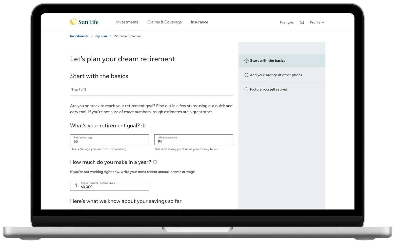
- Start with the basics We fill in what we already know about you, like your Sun Life savings and contributions, and start with common defaults, like retiring at 65. You start partway done, which subverts the expectation that planning will be hard. We also tell you we’ve already factored in government pensions, so you’re in the driver’s seat while we handle the complicated bits.
- Add your savings at other places A short, plain-language list of account types, where rough estimates are welcome. The last thing we wanted was for someone to drop off because they had to dig through all their accounts. That feels like work and this should feel easy. You can update it later once you see your plan’s value.
- Picture yourself retired Instead of asking for a savings target, we ask how you want to live: spend the same, a bit less, a bit more, or build your own budget. The target comes from that. There’s no right or wrong answer so the content paints a picture of what each choice could look like: “a bit more” might mean more money for travel while “a bit less” may mean less money but still a fulfilling life filled with time with family or hobbies like gardening.
That last step changed how people felt about the whole task and it became the planner’s biggest difference from other financial institutions’ tools. Testers picked the lifestyle options in roughly equal numbers which told us they were thinking about their own lives instead of accepting a default. In testing, one participant wrote: “The lifestyle section is nice as it lets me imagine what I would be doing and spending in retirement.” Another described the content as “calm — the language and totals do not generate anxiety or fear.” It answered one of the questions we started with in the sprint: How might we keep people from feeling overwhelmed?
4Let’s choose the form everyone can use
This was one of the hardest decisions I had to make. For the first iteration of our tool, I designed the opening step as a sentence you complete: “I’m 48 years old and want to retire at 65. I make $60,000 a year…” In the design sprint, our group fell in love with this approach. It was a unique and unintimidating design that made the whole form feel personalized. It also brought our behavioural economics research to life: turning the form into a story builds buy-in, both to creating a plan and to using it.
Then our April 2023 test results went backwards. Our usability score fell from 87% to 76% and people took much longer. Other changes played a part, but the drop told us to look harder at the format itself. So I ran a follow-up test, comparing the sentence inputs against standard text fields head to head.
The text fields scored 10% higher on ease of use and, to my surprise, 12% higher on feeling friendly and personal. User preference was split right down the middle. Accessibility made it clearer. Our accessibility specialist also pointed out that hiding the labels, while technically compliant, would make the form harder for people who use speech recognition software.
I recommended the text fields. Our director of financial planning was apprehensive but once he saw the test results and usability case I laid out, he came onboard. Everyone would get the same experience and there was less confusion because the tool matched how people expected it to look. The trade-off was real: we gave up a more original design that carried the storytelling idea from our behavioural economics research. I told the team I was sad to lose it, but I’d rather ship a form everyone can use than one some people love. In the next round, our usability score (SUM) reached 96%.
| Round | When | Usability score | What changed |
|---|---|---|---|
| Old tool | Baseline | 66% | 58% of people could finish a plan |
| Sprint | Feb 2023 | 87% | First prototype: task success rose to 94% |
| Iteration 1 | Apr 2023 | 76% | Sentence inputs, and the step navigation removed |
| Iteration 2 | Summer 2023 | 96% | Text fields, and the step navigation back |
| Final | Sep 2023 | 96% | 100% of participants could finish a plan |
05 Outcomes
The planner launched on April 28, 2024 and 2,523 people built a plan on day one. It replaced the old tool and laid the groundwork for new goals built the same way.
- 137K
- retirement plans created in the first year
- 127%
- of leadership’s target for plans created, eight months after launch
- 58%→100%
- of test participants could finish a plan, comparing the old tool to the new
- 66%→96%
- on the usability score (SUM), comparing the old tool to the new planner
In the final round, people rated ease of use 6.4 out of 7, up 30% from the old tool. In their words: “It was a breeze.” “It’s simpler than what is in the market right now.” “I like the simplicity of the website. It’s very easy to use for those who are not pro at computers… and I know exactly what steps I need to take.”
06 Unfinished Business
To ship on time, we left one thing out: a results page where you could adjust your plan and get a specific recommendation. People in every round of testing had asked for it. The business decided people could go back into the tool to adjust their numbers instead. We planned this for our second release.
A year after launch, the usage data showed what that gap cost. About a quarter went on to a detailed plan, and around half a percent reached an advisor. Three in four saw their results and left. They told us why: “I don’t know how to improve my goal.” “I don’t know what I should do next.” Every major competitor already let people adjust their results and recommended an amount to save. So had our old tool, and its data showed planning pays off with increased contributions. To me, the reason seemed clear: the old tool told people how much more to save.
In 2025 I completed Catalyst, Sun Life’s six-month design leadership program. For my final project I made the case to the planning team’s leaders: We’ve ignored motivated clients who want to plan and left money on the table. The argument fit on one slide: getting people to make a plan isn’t enough on its own. The value comes when they act on it. I proposed two additions: show people how a change would affect their goal and give them a specific recommendation to act on. I ran the numbers myself based on the business case that originated the retirement planner work. If we could get a quarter of the people who left to act on their plan, and they behaved the way our internal data suggested, that would add roughly $2.7M a year in contributions and $590M in assets under management over time.
It was a great exercise, but I soon moved to another area of the company and the work wasn’t prioritized. If I could do it again, I’d still make the same case but I’d make it sooner. Before launch, I argued for the results page based on user feedback — what people told us in testing. Today, I’d put it in the business’s own terms from the start, outlining the contributions and savings it would add. I have no doubt this work will be prioritized at some point in the future but as is the case in many places, there is a stronger appetite to build new rather than build deeper.
With that said, this project was still a real success and we exceeded our target for plan creations which was our program’s initial key success metric. It’s also a project I actively heard feedback about in real life from friends and family who have workplace investments through Sun Life. They used the tool, found it was easy to use and complete, and now have a plan in place which is just amazing.