TLDR A tale in 45 seconds
People with workplace investments through Sun Life managed their accounts on a website that had grown five different navigation menus. Of the people who rated the site poorly, 39% blamed the navigation. Leadership asked for a quick fix. I designed and tested two, and both showed the same thing: better menus could get people to a page, but the information they needed was still scattered. So I made the case for an idea I’d been sketching on the side: one page for each account, with its balance, transactions, and investments together. It was built so the old pages around it could be retired. Leadership fast-tracked it, and I set the design direction while a product team built it. Since it launched, 53% of visits to the contribution flow start there, and contributions are up $2.1 million over the same period last year. I’ve been its designer since 2026. In our latest testing, every task scored between 94% and 97% on usability.
01 The Problem
Many Canadians have workplace investments through Sun Life. They check and manage those accounts on our website. Over the years, the investments area of the site has grown five different navigation menus, built in several design systems.
People noticed. In our sign-out survey, 39% of those who gave us a low satisfaction score said navigation was the reason and 21% brought it up on their own when we asked what we should improve. One person put it plainly: the site felt like “it was created in the 1970s and has never been reviewed.”
But the menus were only a symptom: everything you needed to know about a single account was spread out across different pages. To check a balance, find a transaction, or change an investment, someone had to visit several pages and often pick their account on each one — all to accomplish a simple task.
02 My Role
My role changed as the project grew. The account page started as my idea in late 2024. I designed the first versions on the side, as part of north-star work with my director on a bigger vision for where the site should go next.
Once it was prioritized in 2025, a separate product team built it. I wasn’t on that team, but I set the design direction and oversaw the work. I met regularly with the team’s designer and content writer, reviewed their designs and testing, gave feedback on direction, and pushed to keep as much of our original scope and vision as we could. It took a little while to find our footing, since the boundaries between our roles weren’t clear at first, but it became a real collaboration.
In 2026, I joined that part of the business as its main designer, and the page I’d started on the side back in 2024 finally became mine to grow.
03 Band-Aid Fix
The first request wasn’t for an account page. People kept raising navigation in our sign-out survey, quarter after quarter, and one of our senior leaders asked for a quick fix: help people get to the right places without rebuilding anything.
Without building anything new, we kept the fix to how links were shown: quick links at the top of the page for the most-used tasks, and more links gathered into our product drop-downs so everything was reachable from the landing page. In testing, some tasks improved, but others got worse: changing investments fell from 63% to 47% on usability, and transaction history from 96% to 86%.
I’d believed in the work, but the results weren’t showing the improvements we needed. People could now reach a task but still couldn’t finish it. The information they needed was still scattered. Better signposts couldn’t fix that. I recommended building an account page that brought that information together and could grow over time, while the pages it replaced were retired. Around the same time, my manager and I wrote navigation guidelines for the whole signed-in site, so new pages would stop adding to the problem we were trying to solve.
04 Sketch to Roadmap
We presented the band-aid solution alongside a bigger idea: a clearer structure for the whole site with a product lens at its centre. When the business decided not to move ahead with the band-aid fix, the senior leader who’d asked for it took a closer look at the account page. He saw that it would ease the navigation problem where it mattered most, by bringing information together and giving every task an obvious home, without needing a full restructure of the site. It wouldn’t fix everything, but it would put us on the right path, and it wouldn’t break the bank.
It also made business sense: better usability scores would help us compete for assets, and a site that met members’ expectations would earn their trust to grow their savings with us, and to keep them with us when they leave their plan.
It was his call to prioritize it, and the green light came much sooner than we expected. Because our designs were ready, when room opened up on a product team’s roadmap, they could start building within weeks, not months. The first release was then refined and delivered in just a single quarter.
05 Key Decisions
1Let’s give each account one page
I started by mapping every piece of account information spread across the site: balances, transactions, investments, forms, beneficiaries, statements. Most visits follow a few well-worn paths: 87% of visitors take one of six main journeys. The structure had to make those six easy to find.
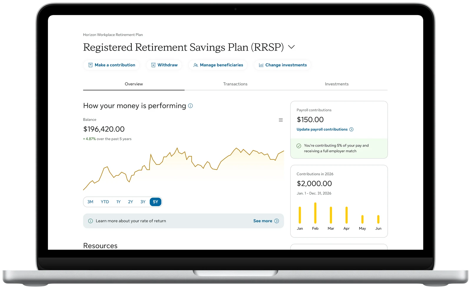
Sorting everything by how people think about their money gave us three lenses (and three tabs). Overview shows how your money is doing, along with basic account information. Transactions presents your history and lets you manage upcoming transactions. Investments breaks your money down: which funds you hold, how it’s split, and resources to understand them. The main actions, like adding money, withdrawing, or changing investments, sit together at the top, so they’re always one tap away, no matter the tab.
The visual design changed a lot across all our iterations. The structure never did, and in the end, it’s the structure that shipped.
2Let’s make every piece replace an old page
Adding a new page to a site with too many pages would only make things worse. So every piece of the account page was designed to replace something. When the page shows your balances, the legacy balances page can go. When it shows your transactions, the legacy transaction history page can go. As the page grows, the site gets smaller. It’s built in our latest design system with accessibility in mind, so every page it replaces is one less that looks out of step, isn’t equitable, and would cost us to fix later. Every link we remove is one less to maintain and regression-test.
That also made it safe to ship small. The page didn’t need to be finished on day one. It only needed to be the place things would move to.
3Let’s fix what testing found
The product team ran three rounds of testing as the page came together. I reviewed each round with them. The hardest task was changing investments, which scored 63% on the old site’s usability score (SUM). On the new page it rose from 31% in the first round to 78% by the third.
The failures taught us as much as the scores. The tabs were so pale that people missed them, and “change funds” was tucked away where nobody looked. Each round, the team made the tabs clearer and the investment actions more direct, and the scores climbed steadily with them.
4Let’s write down what the first release left out
To hit its launch date, the first release left out a lot of the initial design: transaction history on the page, a growth chart, insights and next steps, and a layout with room for them. Some of it wasn’t technically possible yet. Some of it simply wasn’t done yet, and the date wouldn’t move.
After launch, I wrote a deck that set out exactly what was cut, why, and what it cost our users. I didn’t want the missing pieces to quietly become permanent. That deck became the plan for what came next, and the growth chart it argued for finally shipped the following year.
06 Outcomes
- 53%
- of visits to the contribution flow now start on the account page
- $2.1M
- more in contributions than the same period last year
- 94–97%
- on the usability score, for every task we tested in April 2026
- 336,000
- visits in the page’s first 52 days
The account page launched in summer 2025 and quickly became the main way people start a contribution. The same is true for other key journeys. That figure validates the model: the account page is where clients expect to start a key journey. Visits to the contribution tool also rose 13% on last year, after a 45% jump in the first week: putting the link right beside your account information made it easier to find. That growth was worth $2.1 million more in contributions.
It helped our call centre too: when representatives walk a member through the site, everything they need is now on one page. When we tested it again in April 2026, finding transaction history reached a 96% usability score, higher than the old site scored in 2022, before any of this work began.
07 The Growth Chart
The first release showed people their balance, but not whether their money was growing. Performance was spread across three pages, and the new accessibility team’s audit found structural barriers on the account page itself. So I didn’t pitch a chart on its own. I proposed three changes that work together: restructure the page into clear sections, add an accessible growth chart, and move rates of return into a drawer. Together, they’d fix the accessibility issues, show performance at a glance, and let us retire the old investment performance page.
Leadership wanted the chart by the end of 2026, and the restructure wouldn’t fit. So we shipped it on the existing page and deferred the structural fixes. I didn’t want the chart to add to the problem, so I designed it to meet WCAG 2.1 from the start: it works by keyboard, announces values to screen readers, and has a full data table behind it. Our data only allows one point per month, less than competitors who show daily values, but more than members had before.
As with the first release, I wrote down what we left out and why. The restructure is now the plan for 2027, and it’s already prototyped with the accessibility team.
08 What Came Next
In 2026, I became the page’s designer, and every change since has followed the original plan: bring in what people need, and retire the page it replaces.
- Transaction history was the page’s most-clicked link in its first weeks, over 86,000 visits, so that’s where we’re going deeper first. We’ve added a Transactions tab that shows recurring contributions and links to full transaction history. We plan to deepen it in 2027, with the full history on the page.
- Messages from employers about their plan now appear on the account page, which let us retire the old balances page. It repeated balances people already saw, and added to the navigation confusion we were trying to fix.
The account page has also changed how our team designs. New work now points people to it. When we improved the investments landing page, we removed account links that now live on the account page. In my current work in the retirement space, the account page plays a key role. Before it existed, every new page had to carry its own product information. Now the account page is the jumping-off point, which lightens the design load on every other page we build.
Looking back, what I’m proudest of is that the idea outlasted every setback. It started as a sketch on the side, lost pieces to a deadline, and was built by a team I wasn’t part of. Because we wrote the vision down, got buy-in, and kept pointing back to it — it never got lost. Now it’s mine to grow, and every release brings it a little closer to what we first drew on the side back in late 2024.